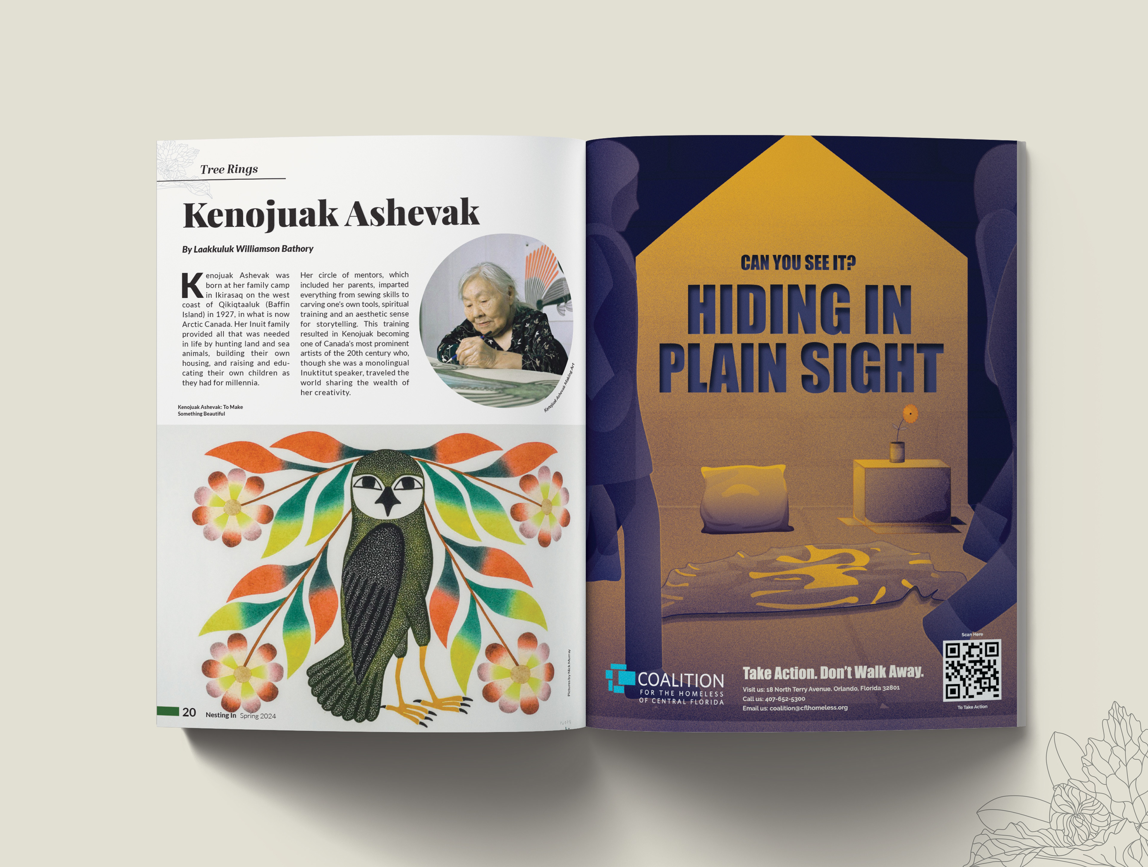
The Magazine
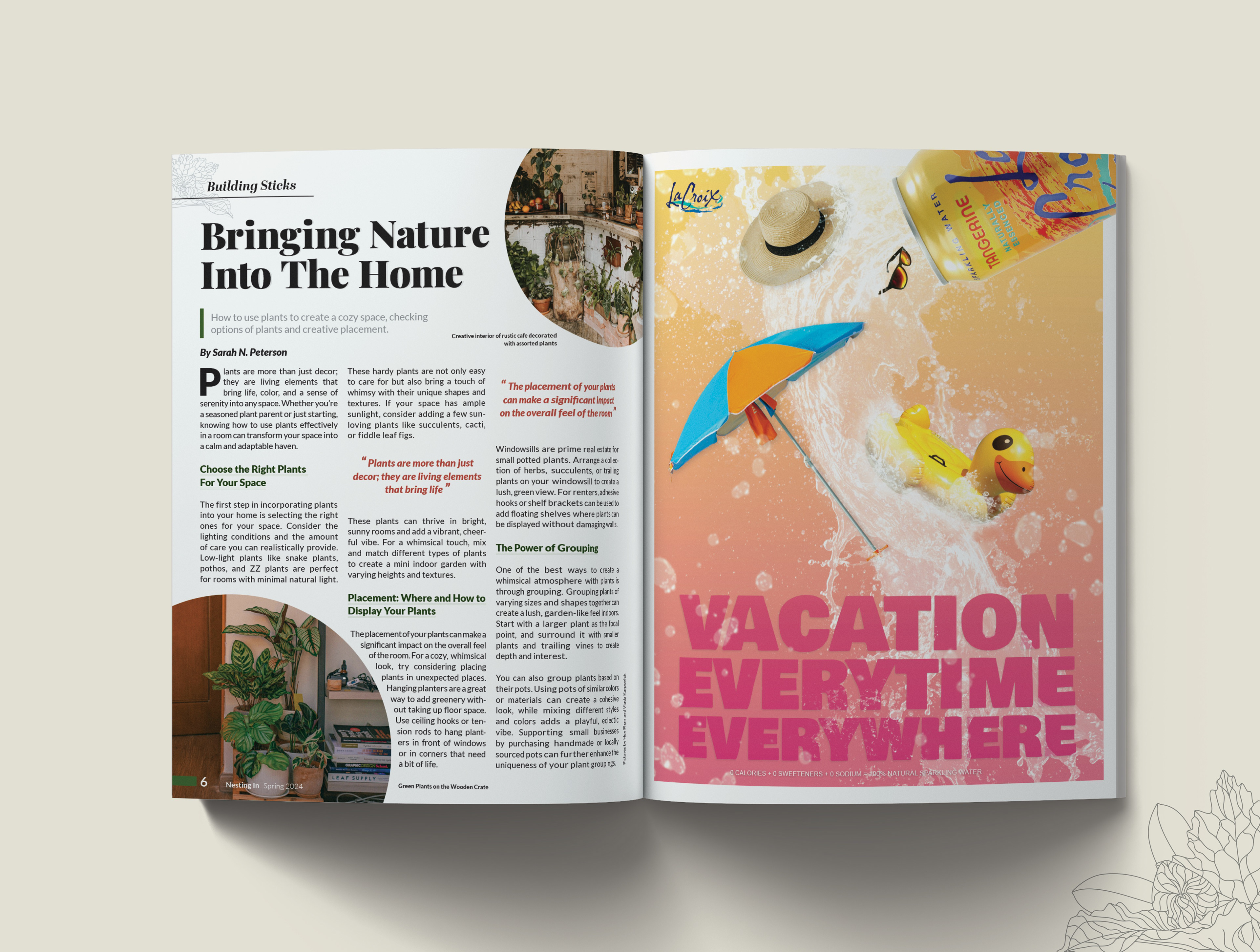
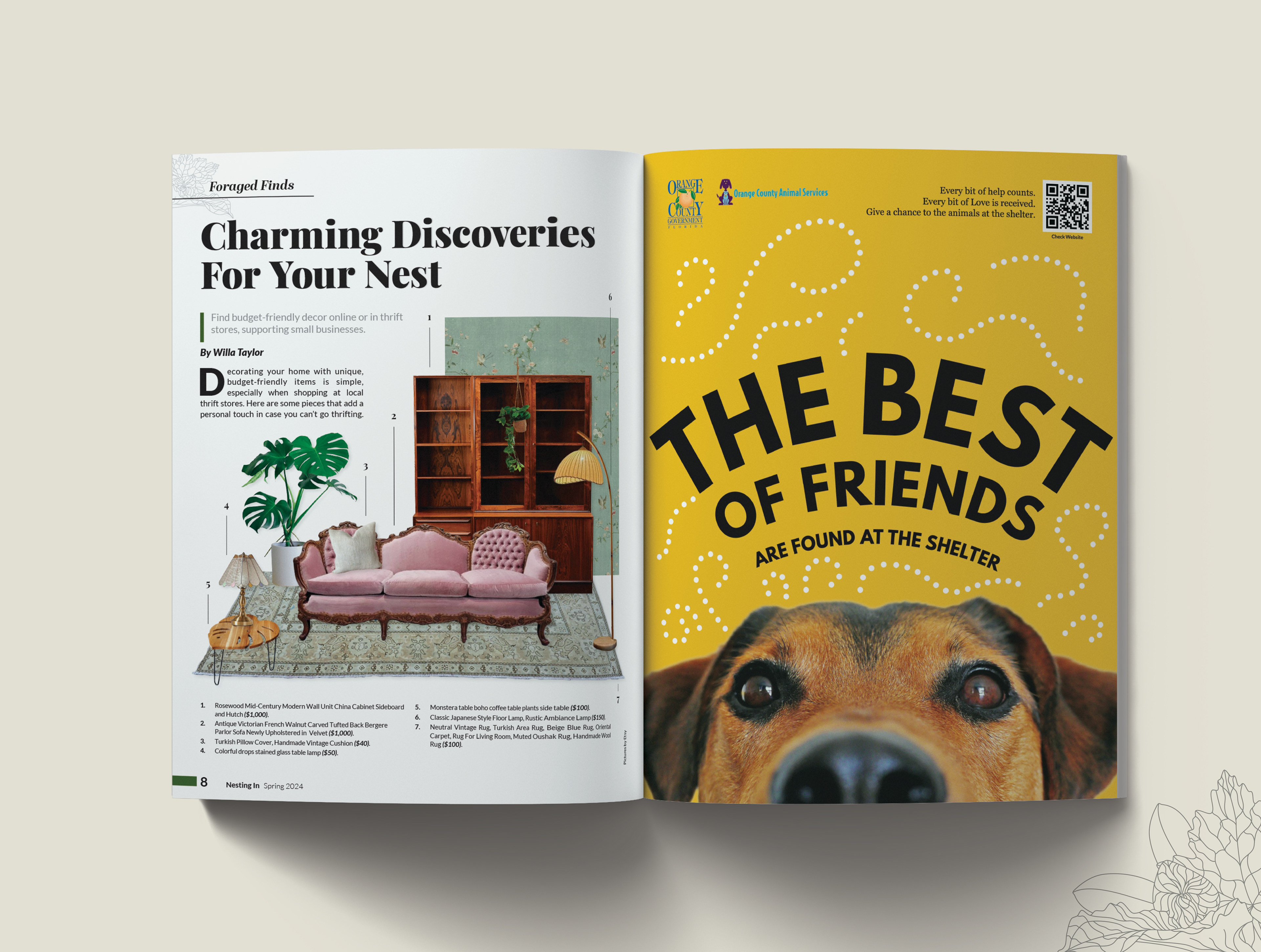
Nesting In is a home and decor magazine that focuses on advising readers on how to decorate their space in ways that align with their healthy and nature-friendly values. Most of their audience are young adult women or retired women with comfortable incomes that want a connection with nature without loosing the privileges of modern culture.
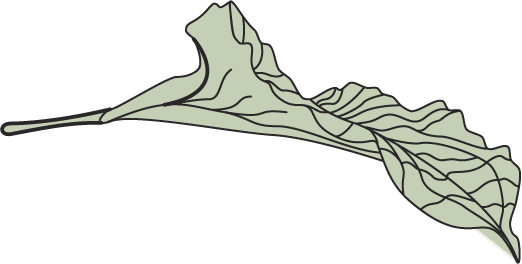
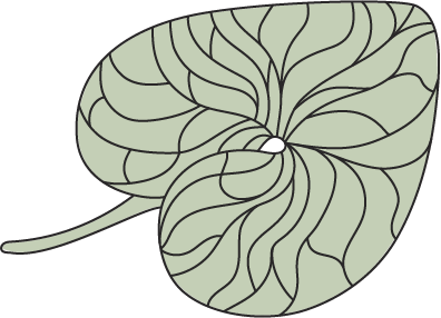
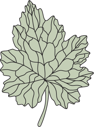
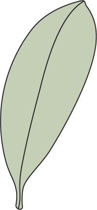
To meet their client’s expectations, the magazine uses popular social media aesthetics such as cottage-core and forage-core to provide a fresh alternative to other generic lifestyles.
The Project
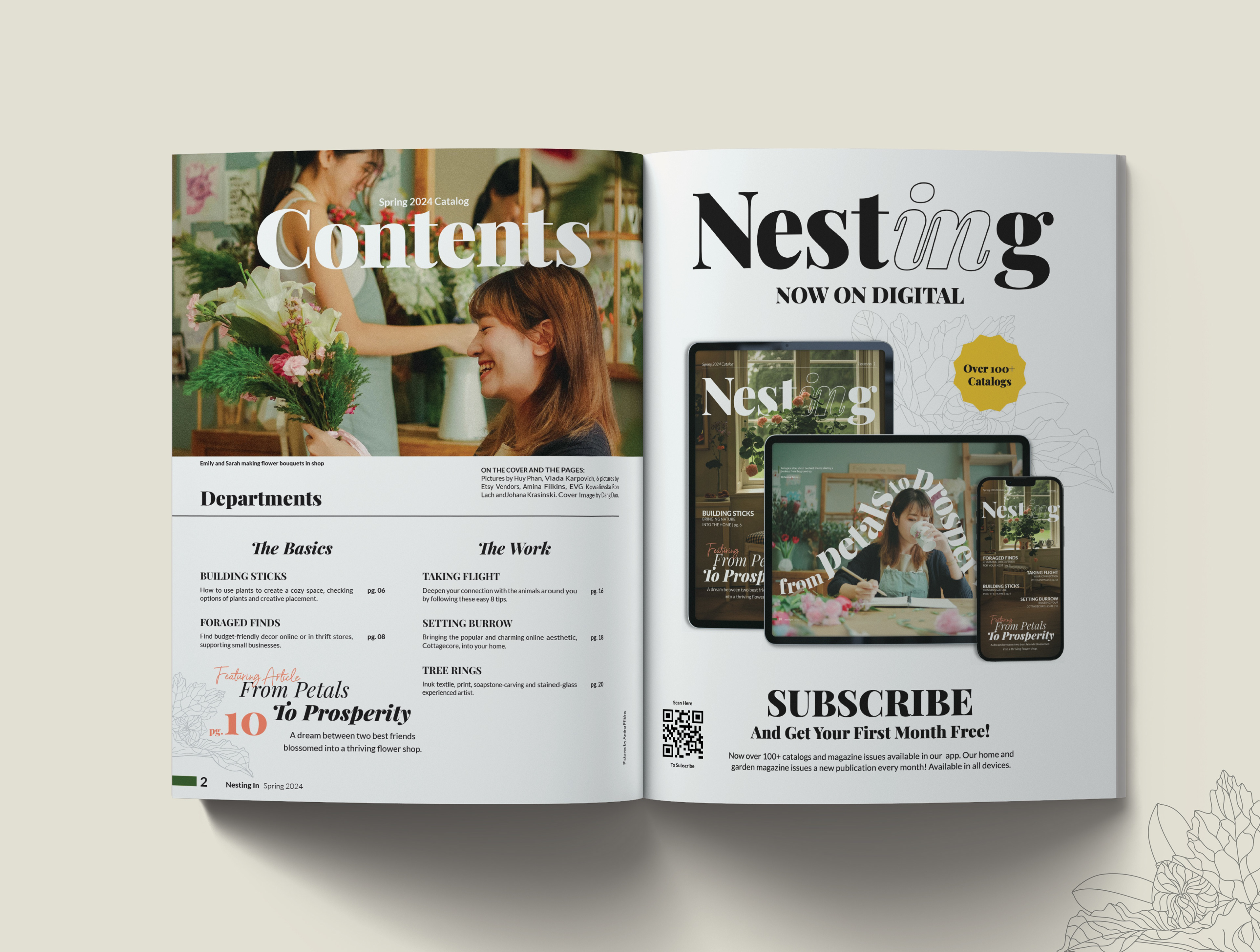
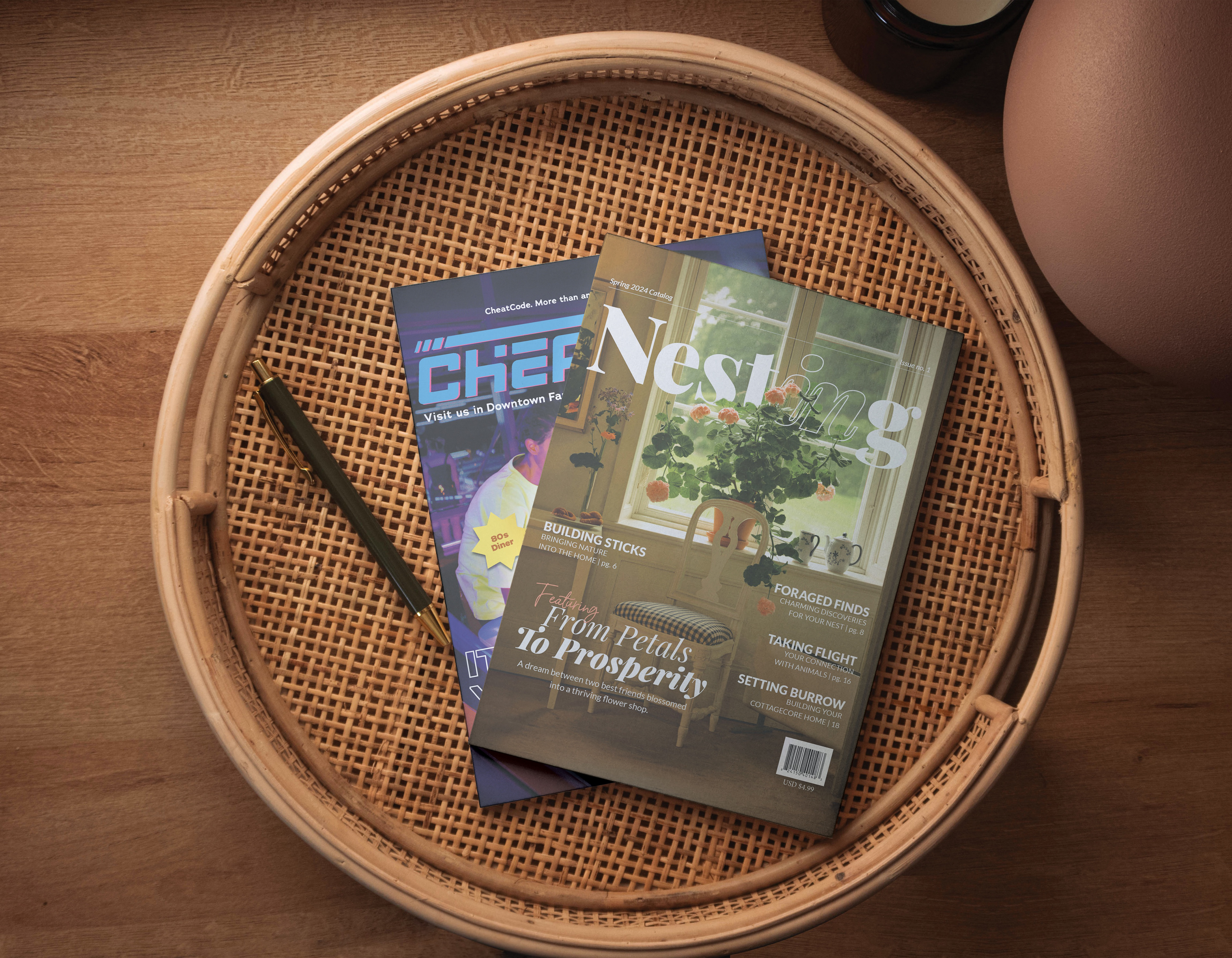
This project requested the design of the brand’s main logo, website, as well as their 2024 spring issue magazine. This was completed in a span of two months and everything in the project, including the advertisements, were created and developed internally.
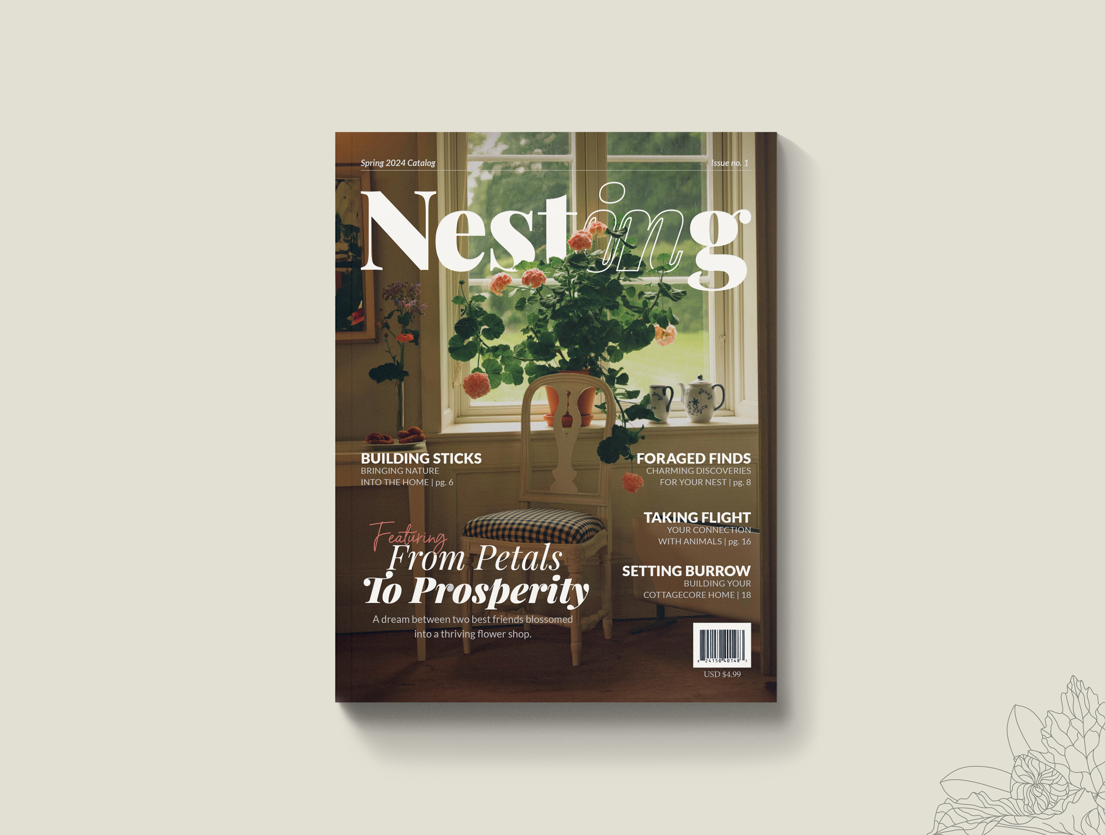
The logo was made using the font: Playfair Display bold. It’s a simple, typography-based design intended to accommodate the printing and publishing standards of the magazine industry.
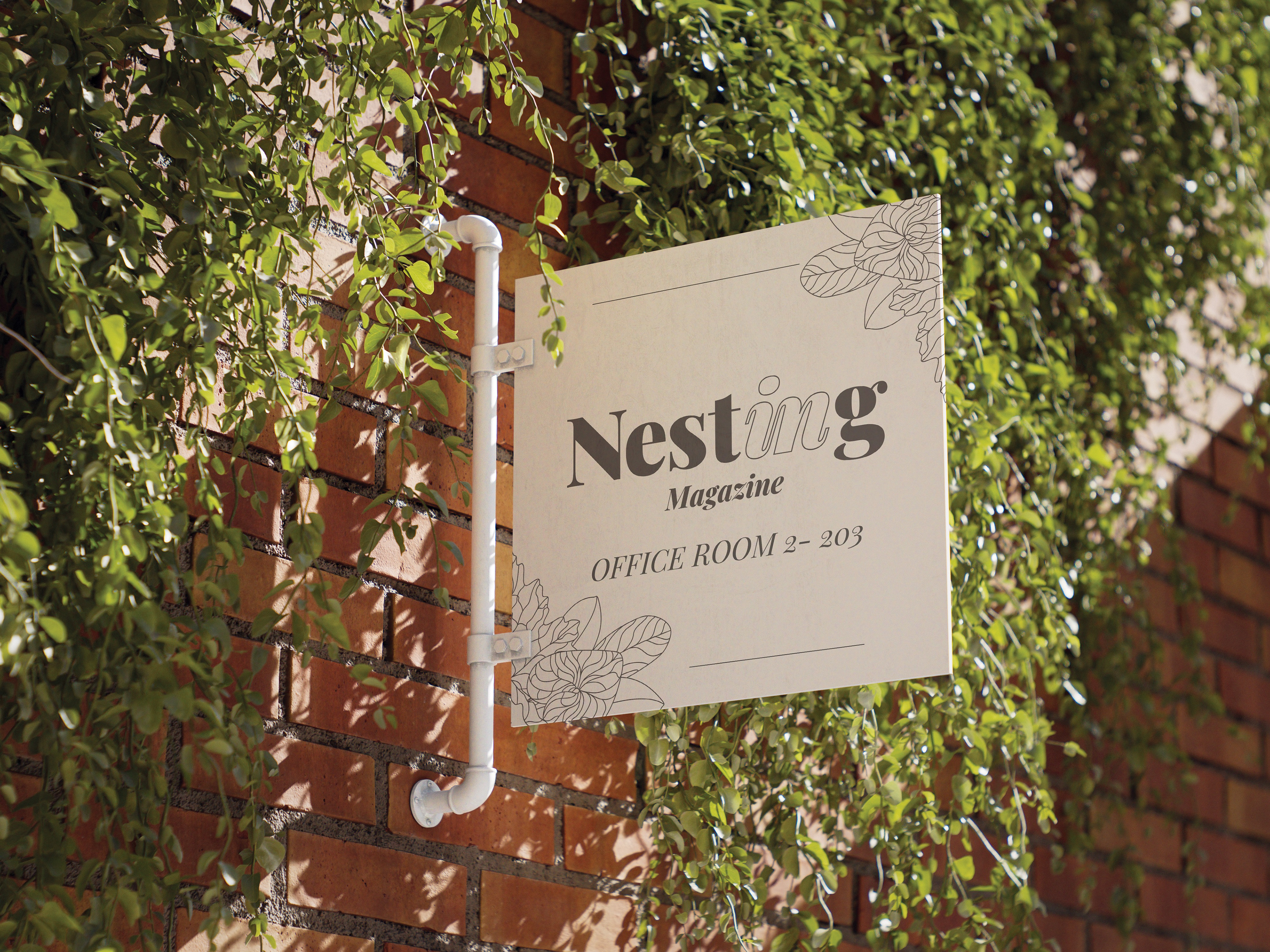
The most iconic part of the logo was created after reducing the complete name of the brand: “Nesting In,” to just “Nesting”—with the “In” merged. The word “In” is stylized in cursive and lined with a transparent fill, intended to both symbolize a window into the elements behind it and to contrast the modern solid style of the rest of the logo.

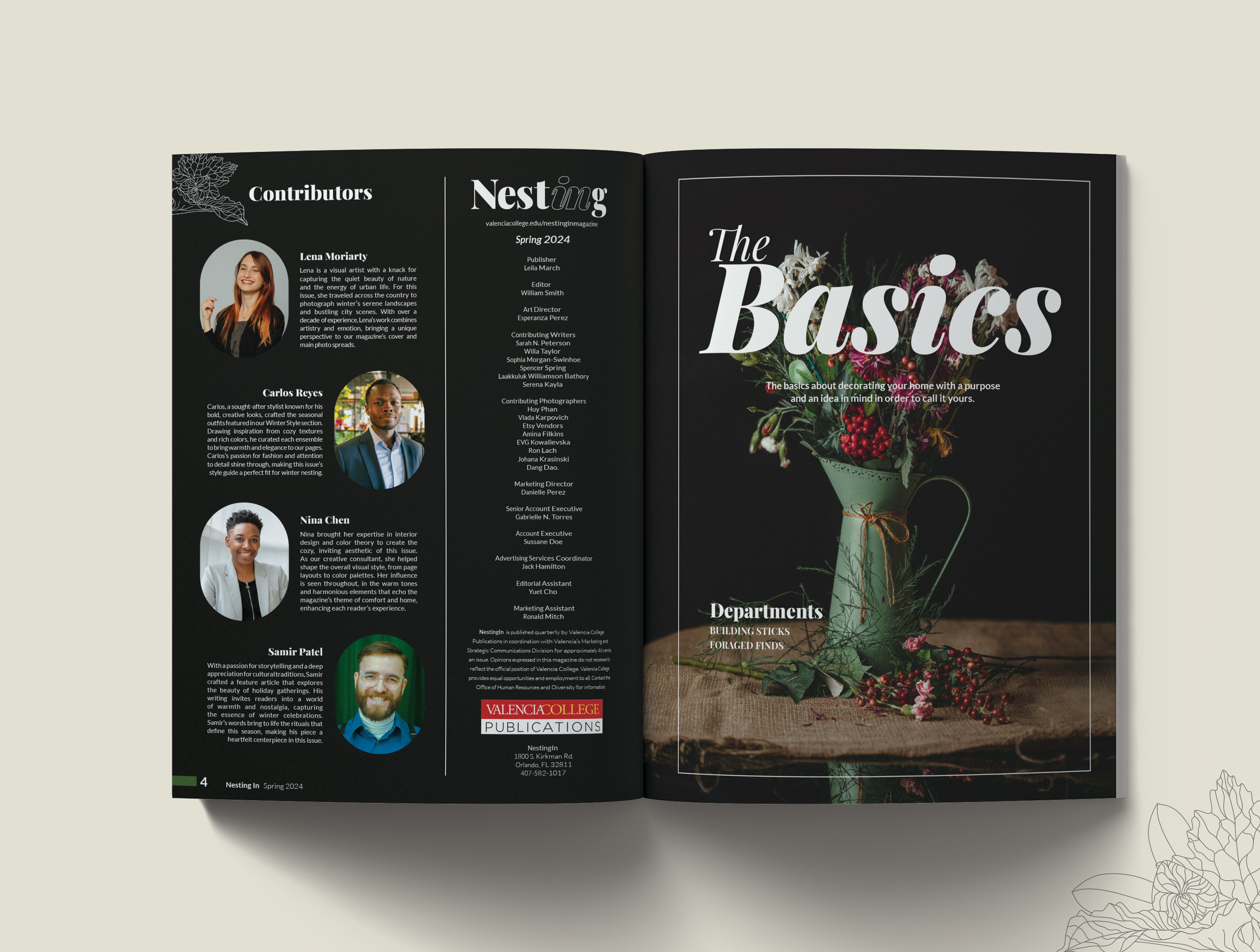
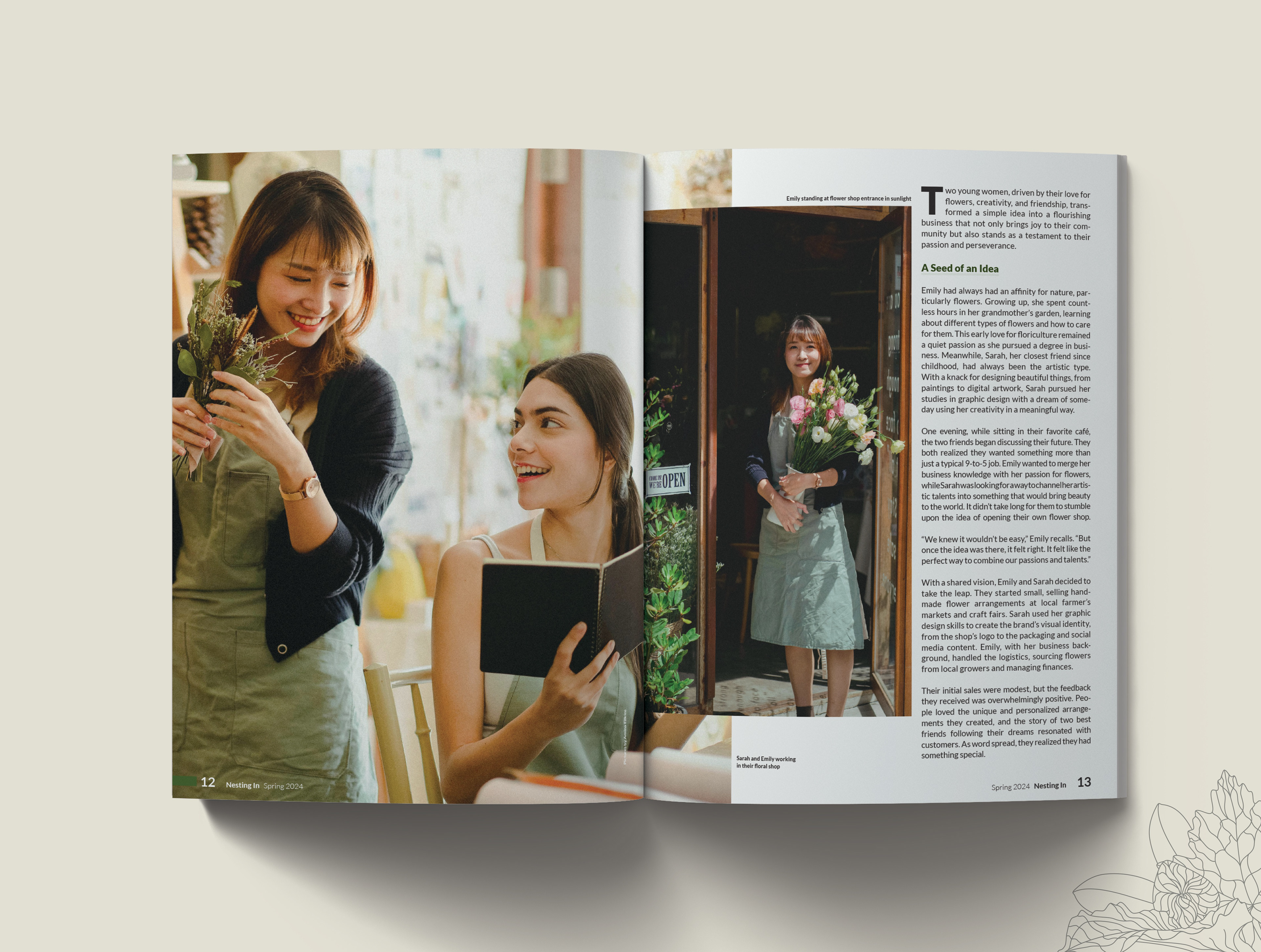
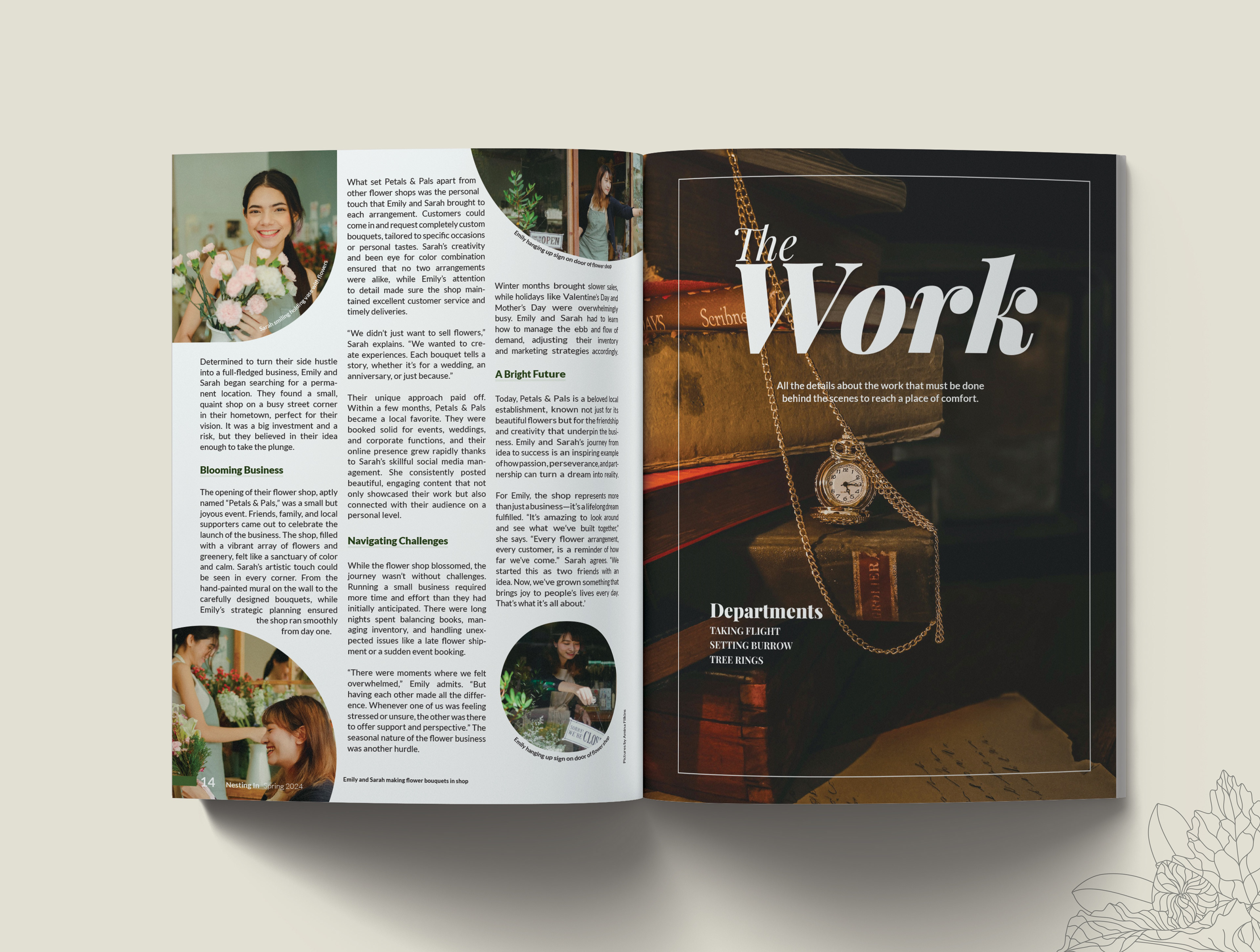
The Magazine
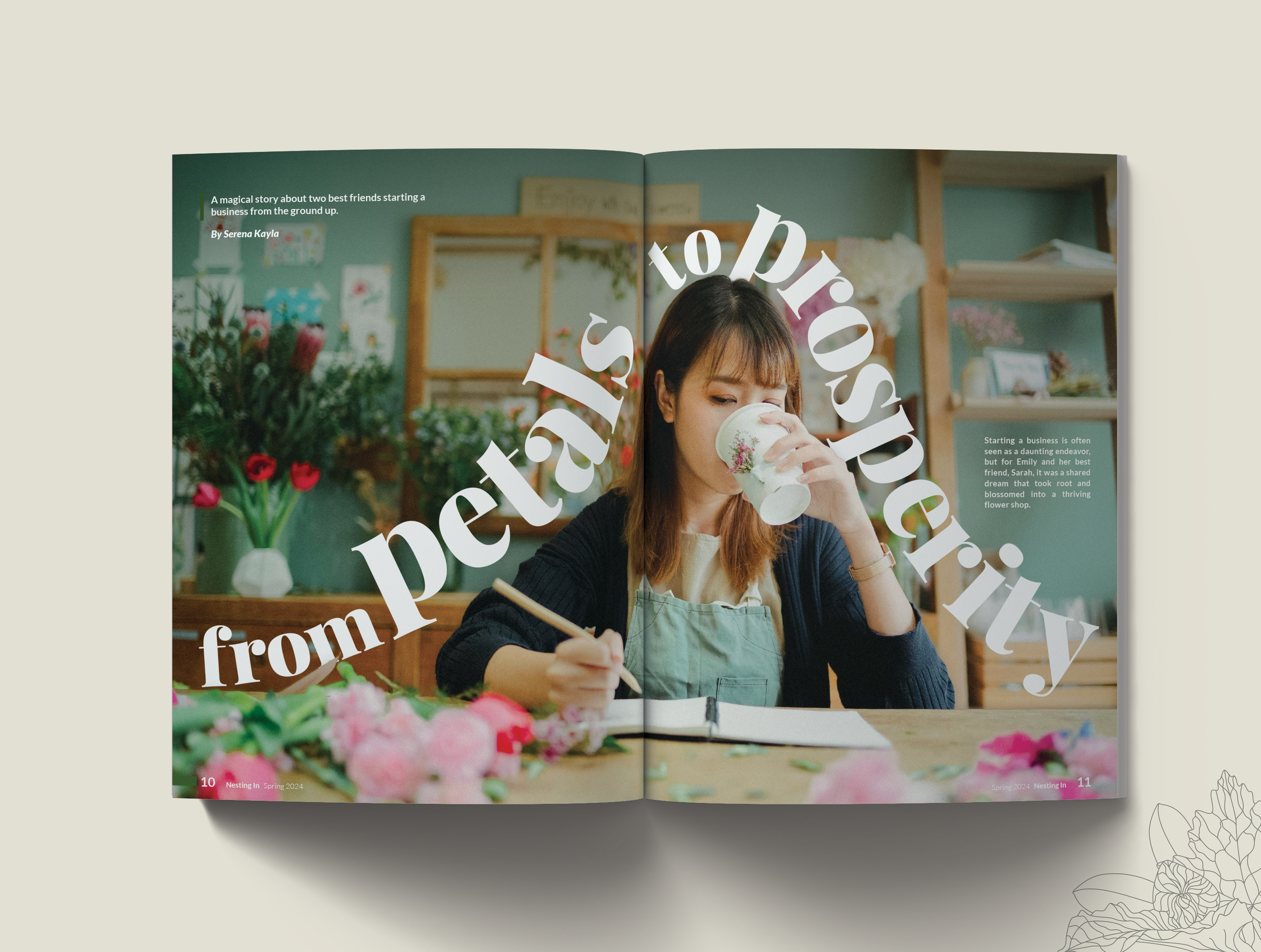
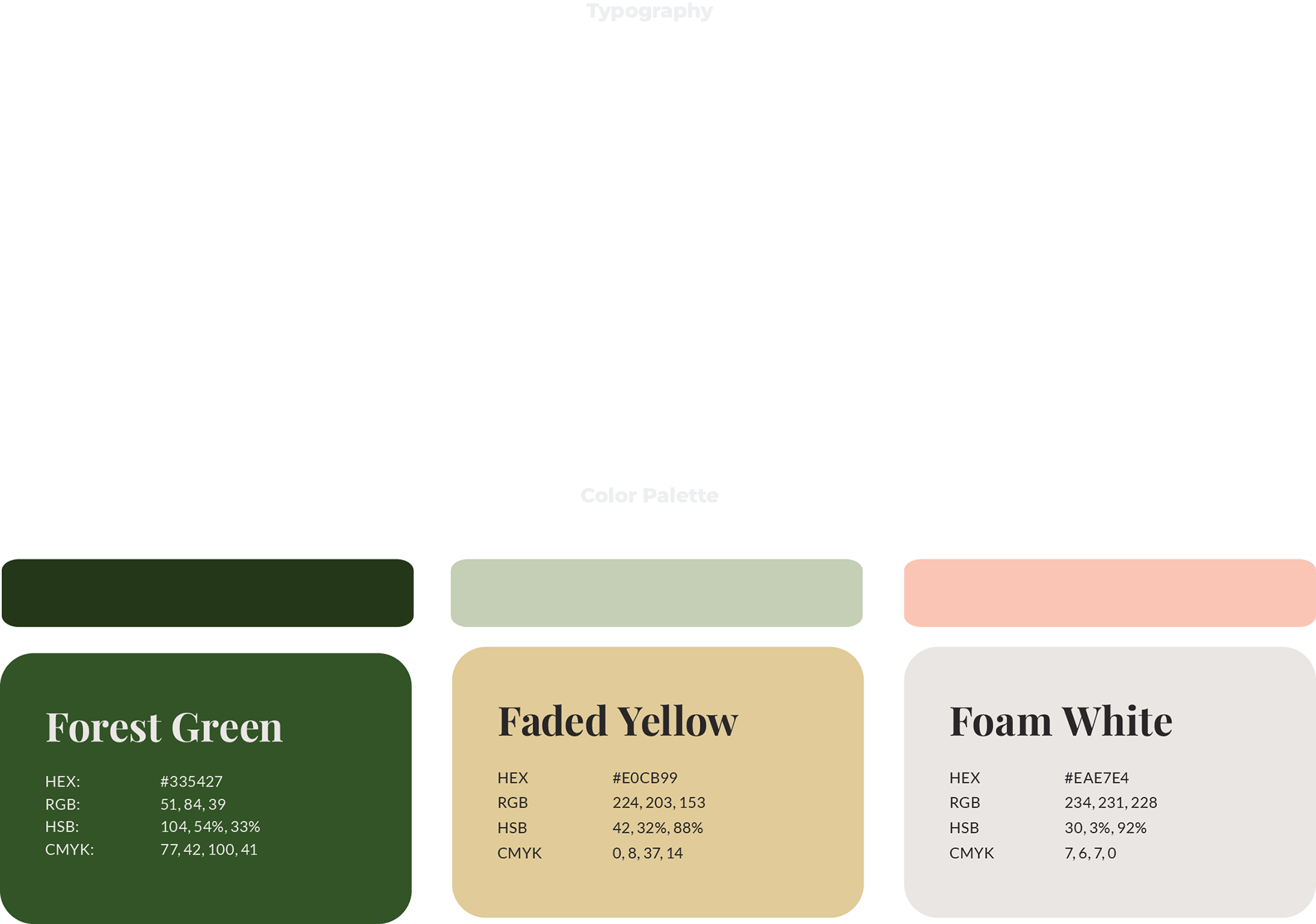
The brand aims to be clean and refreshing, with a style that merges vintage and modern to provide a forest cottage “vibe”. To achieve these goals, I chose a palette of shades of greens, with yellow and white accents. The headline font is both elegant and bold to match the chosen style, and for the body copy we went with a leaner, simpler font.